Do you ever find yourself thinking, “man, something feels off on my website.”
My very first question to you would be: do you have a brand style guide or are you just wingin’ it?
When your brand visuals feel scattered or your website looks like a Pinterest design board gone rogue, it’s not a reflection of your talent—it’s a strategy problem. You don’t necessarily need to panic and think you must rebrand everything.
What you need is a solid brand style guide to rein it all in and build something that actually feels cohesive, strategic, and hella true to who you are.
So here’s how we’re going to break it down:
- What is a style guide?
- Why do you need one?
- And how do you create one you’ll actually use?
First—What Is a Brand Style Guide?
A brand style guide is exactly what it sounds like. It’s a guide to your visual brand identity. It’s what keeps your branding from becoming a chaotic collage of fonts and color choices. It outlines your entire brand vibe—from your color palette and typography to logo variations, spacing and even how your buttons should show up on your site.
We don’t do half-ass style guides around here that you look at once and toss!
This is something I’m so passionate about, that even our Showit website templates will come with a style guide to ensure you have all the tools a website designer would have. Sound like THE DREAM? Sign up to get on our Website Template Waitlist (& get a juicy discount while you’re at it)
A brand style guide is your holy grail for staying visually consistent across everything you create.
You ever see a brand and just want to click away because it feels overwhelming, chaotic or too much? Or have you looked at a brand and can’t tell it apart from other brands you’ve seen?
It’s because branding basics like fonts and colors isn’t just about looking pretty—they’re about creating recognizability, trust and MAXIMUM brand impact.
Second—Why You’re Struggling Without A Brand Style Guide
Here’s the tell-it-to-straight truth: if you don’t have a brand style guide or if you have one from a designer but don’t use it, that means you’re choosing colors based on mood, grabbing fonts on a whim, and slapping logos wherever they fit (or more likely where they don’t fit 😅). That might feel “creative” in the moment, but in reality it’s killing your brand’s clarity—and very likely turning off dream clients.
When your brand feels “meh” or like it’s missing your unique fire, it’s usually because you’re building piece-by-piece without a strategy. When your brand feels “meh” or like it’s missing your unique fire, it’s usually because you’re building piece-by-piece without a strategy. That’s like showing up to a festival with no lineup, no map, and no idea where the good stages are. Chaotic. Overwhelming. Not the vibe. A brand style guide is what pulls it all together into something cohesive, clear and impactful AF.
Third—How to Build a Brand Style Guide That Actually Works
(aka one you will actually use on the daily)
These are the non-negotiables branding basics that deserve a permanent home in your style guide:
1. Logo Usage
Don’t just drop your main logo in and call it a day. You need multiple variations for different situations:
🔥 Full logo (great for large-scale designs, homepage headers, print materials, stationery)
🔥 Simplified logo (for smaller spaces, like mobile headers, slide decks)
🔥 Submarks or icons (for smallest spaces, like IG profile pic, watermarks, social icons, email signature)
Make sure they’re all listed in your guide and ready to go. Treat it like your brand’s wardrobe—you need options, but they all still perfectly fit “you.”
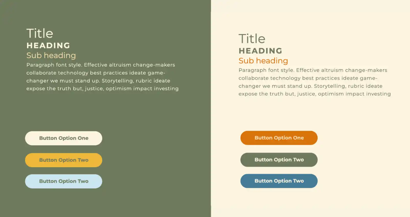
2. Color Palette Guide
If you’ve ever been tempted to stray from your brand colors just because a new trend caught your eye… stop right there, friend.
CHOOSING YOUR BRAND COLORS
Your color choices should be intentional. Pick a palette that’s:
🔥 Memorable (this is how people recognize you at a glance)
🔥 Emotionally aligned with your brand energy
🔥 Structured by hierarchy (hello, 60-30-10 rule)
POWER PLAY PRO-TIP: The 60-30-10 rule is less about using exactly three colors—and more about creating visual balance. That 60%? It can be a combo of your two main brand colors. The 30% might be a supporting shade (or two), and that final 10% is your accent moment—the one that makes things pop.
It’s not about strict math—it’s about intentional hierarchy.
COLOR COMBINATIONS
This is the part most folks skip—and it’s the reason some branding looks off even when the right colors are technically being used.
Lay out which color combos work best:
🔥 Text color on background
🔥 Button color on various backgrounds
🔥 Accent pairings that pop but don’t clash
This makes creating visual content (like new website pages, FB ads, Instagram stories, etc) so effortless and way more impactful and branded.
3. Fonts / Typography
Choose your typography stack and stick to it. Your fonts aren’t just decoration. They’re functional. They’re strategic. They’re how you communicate at a glance before anyone reads a single word. Here’s the breakdown:
🔥 Headers = bold and eye-catching. They should grab attention the second someone lands on your site or scrolls past your post.
🔥 Sub-headers = clean (and still impactful) supporting role. Still punchy, but secondary. Think of them as your wingman—guiding without overshadowing.
🔥 Body text = readable AF. If someone has to squint or tilt their head, you’ve already lost them. So make sure whatever you choose is effortless (not overwhelming) to read.
The secret sauce to your brand’s fonts? It’s hierarchy, my friend!
Let’s be real: people don’t read everything. They skim first. If your text structure doesn’t guide them through that skim in a way that actually hooks them, they’re bouncing.
Hierarchy is how you lead the eye through your content. It’s the design equivalent of saying, “Hey, this is the headline. Now here’s the next most important thing. And if you’re really into it, keep reading…”
Without clear contrast between your header styles, subheaders, and body copy, your reader’s brain doesn’t know where to go—and they won’t bother sticking around to figure it out.
POWER PLAY PRO-TIP: Go the extra mile and include your font weights, sizing and line spacing guidelines in your style guide and make future you so damn confident (which we LOVE to see).
4. Button Styles
Buttons might seem like a tiny detail, but in the world of visual brand identity, they’re literally the difference between someone doing what you want them to or just glossing over them.Or even worse, trying to click something that’s not a button, getting annoyed and bouncing. ✌🏼 So in your style guide, you’ll want to define:
🔥 Button shapes
🔥 Hover styles
🔥 Font size/color inside your buttons
🔥 Which colors go with certain backgrounds + which color buttons look best with certain backgrounds
This is what helps your site feel polished instead of patched together.
5. Spacing (A.K.A. White Space)
If you take absolutely nothing from this but one, please, PLEASE, let it be white space, friend!!
As a brand and web designer, this is THE game changer between a thrown together site and this-feels-professionally-designed one. Spacing creates breathing room—and clutter is the quickest way to make visitors feel subconsciously overwhelmed or uncomfortable. Outline your preferred margins, padding, and whitespace rules. Make it feel clean and intentional, not crammed.
Real-World Examples of My Go-To Spacing Guidelines:
WEBSITES:
- At least 100px between major sections. (Think main intro → about → services → testimonials, etc.) On mobile, scale it down a bit—40px minimum.
- 50px between grouped content blocks within a section. (For example, sections where you have a list of services or stacked photos/text combos.)
- 25px between headings, body copy, and buttons.
These numbers aren’t rules written in stone—but they’re solid AF starting points to help your design feel less DIY and more intentionally aligned.
SOCIAL POSTS:
Now, this one’s a bit trickier since size + format varies. But here’s what I recommend:
- Stick to the inner Canva guide lines. (Yes, those little purple borders are your friends—so don’t ignore ’em.)
- Keep a healthy gap between text + visuals. If they’re overlapping, it better be deliberate and READABLE. Maximalism is cool when it’s intentional, otherwise, it’s just messy.
So What Does a Real Brand Style Guide Look Like?
If you’re picturing a simple PDF with a few hex codes and a logo file tossed in… dude, think again.
A true brand style guide (like the ones we create at Lenya Creative) is a powerhouse document that lays out every piece of your brand’s visual system in a clean, easy-to-follow way. Think logos, color palettes, brand fonts, iconography, color combos, button styles, layout structure, and even spacing rules—all in one place.
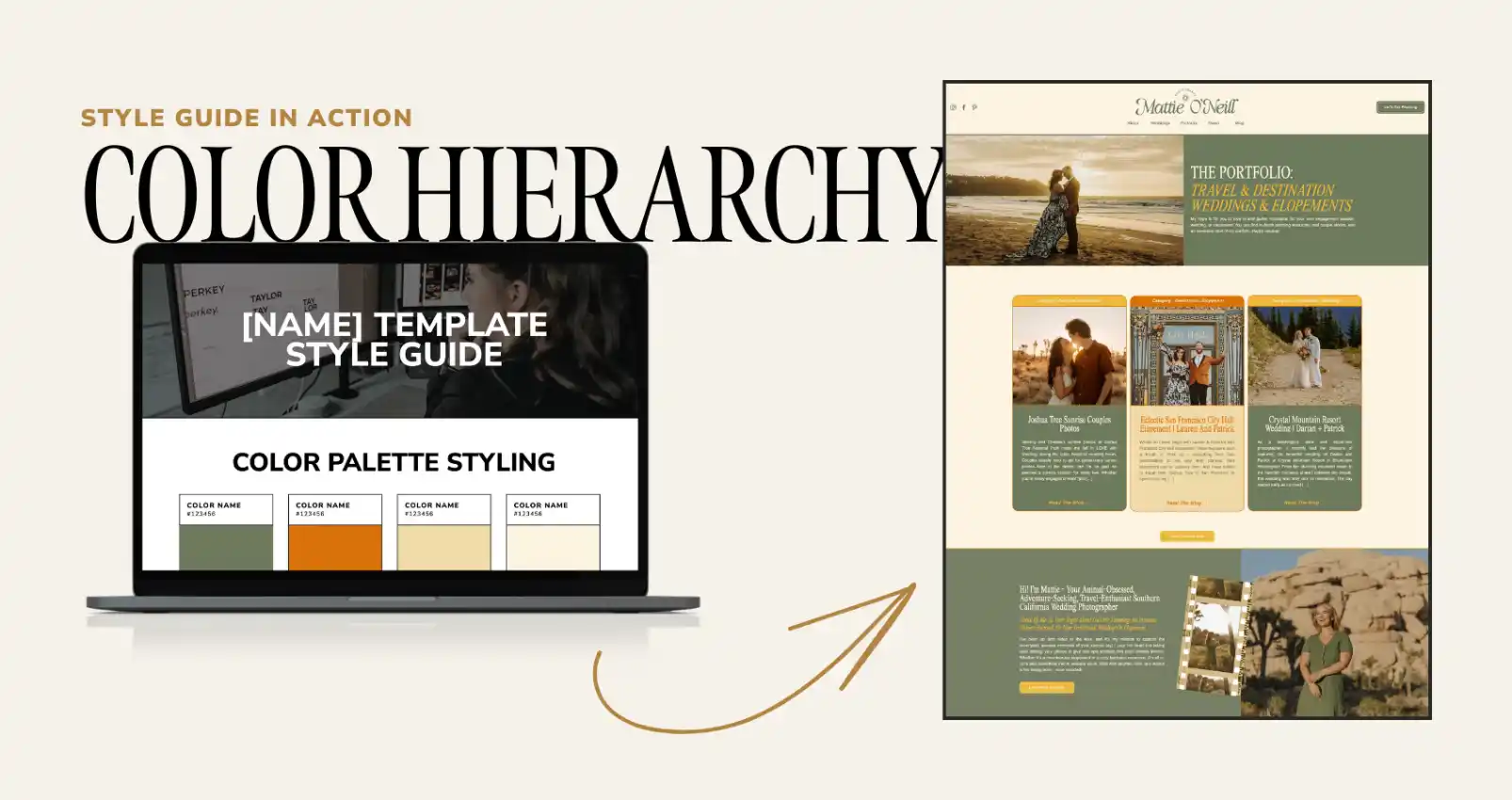
Need to see it to believe it?
Check out this visual example from one of the client’s in our pride. This brand style guide is for a wedding photographer:
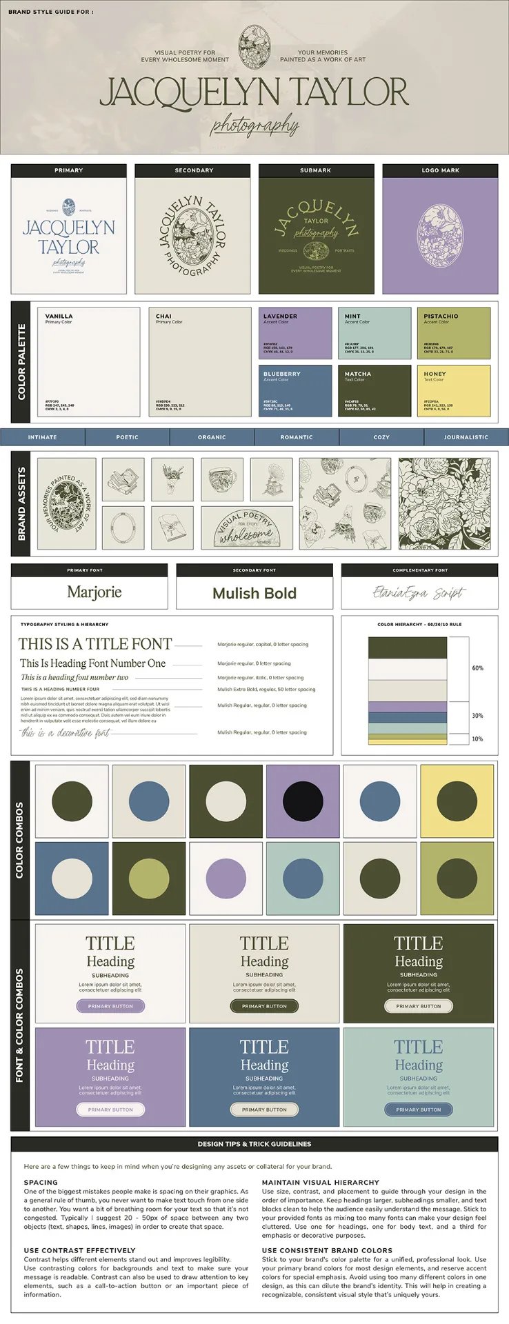
Everything in their guide is intentional and strategic. From the 60-30-10 color hierarchy to the exact button layouts and font pairings — it’s designed to make every piece of the brand experience cohesive, elevated and unmistakably aligned with their vibe.
THAT’S the difference between “eh, kinda on-brand” and “hell yes, that’s so them.”
Are These Branding Basics? Sure.
But This Is How You Build a Visual POWERHOUSE.
A brand style guide isn’t just some pretty PDF. It’s what helps your brand look like it has its sh*t together—even when you’re still figuring things out behind the scenes.
It’s what makes you look intentional,trustworthy and undeniably YOU.
It’s what gives you consistency across every Instagram post, every website page, every marketing material—without constantly second-guessing if things are “on brand.”
So if you’re ready to stop feeling “off,” stop the guesswork. Start creating a brand that makes people feel something the second they land on your page…
Get that brand style guide built. Your future self (and your dream clients) will thank you.
Need help creating a brand style guide that doesn’t feel basic boring AF?
We do that. 💪 We’re not about to let you blend in – we want your brand to own its space with damn good design.